For those of us who collect
fountain pens, this is a time like no other. Not only
are the major manufacturers putting forth a steady
stream of new pens, many of them quite good; but there
are literally dozens of craftsmen who are making small
numbers of exquisite custom creations. In addition,
there are many people like me who focus on the vintage
pens of the so-called Golden Age, but wish that there
were a way to combine the best of vintage and modern.
For a handful of folks who will acquire one, that wish
has become reality with the creation of The PENguin
Pen.
Recently, several people have asked about the origins
of this project. The PENguin Pen came out of my awareness
that my website, The PENguin, had a following among
people who share my taste in pens and that there has
emerged a growing market for custom pens made in very
small lots. So, by the middle of 2005 I began thinking
about producing a pen that would reflect my own taste
in pens and might appeal to others. To accomplish this,
however, I would need a partner, someone who shared
my sensibilities and had the knowledge and skills to
realize my vision.
From the beginning it was clear to me who that would
be. I have known Bruce Hirschman for many years as
a friend, a fellow BMW fanatic and a Bay Area pen collector.
A few years ago, Bruce decided to extend his pen hobby
by making pens under the name of Bruno Corsini. Knowing
Bruce as I do, I had every confidence that he would
emerge as a skilled and meticulous craftsman, and so
he has.
When I approached Bruce he was open to the concept,
despite the growing popularity of his own pens and
the increasing demands on his time. By the end of the
year we began discussing both concept and design. As
a user, rather than a maker of pens, my first thought
was to create something that would reflect my esthetics.
It would be midway in size between a Pelikan 100, my
favorite vintage pen, and an M800, my favorite modern,
and its design influences would reflect a growing interest
on my part in Italian pens. |
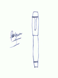
Bruce approached the project from a different perspective. To him, the new
pen needed to reflect what the PENguin website has come to represent. Therefore,
while influenced by Pelikan pens, which drive the site, it also needed to reflect
the bird for which the site is named. Despite my preconceptions, I immediately
saw his point.

With that, the basic design idiom of the pen was set. We both agreed that
the pen would draw its inspiration on the classical German modernism that shaped
the first Pelikans. For many people, however, those pens are too small and
delicate to use on a daily basis. In addition, Bruce makes large pens, so while
this pen would be based on the early pens it would not copy them.
Next came the question of materials, and here Bruce and I were in total agreement.
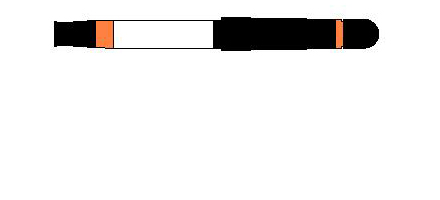
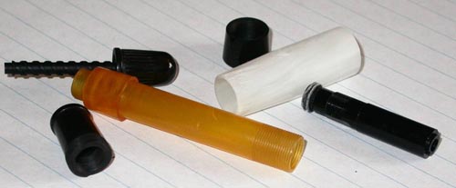
Hard rubber would be used for the cap and filler, and amber acrylic, in place
of delicate and hard to work celluloid, would make up the body. The white barrel
band, which made The PENguin pen look like its namesake would be made of "alternative
ivory." The clip, designed to approximate the shape of the Penguin's beak,
was to be cast in 10K gold. In addition, Bruce suggested the pen's signature
feature, the translucent orange "Emperor Penguin" band just under the clip
ring.
The filler was more a question of how than what. From the beginning we agreed
that the pen had to be a piston filler. But piston mechanisms are complex and,
done right, expensive to produce. We looked at several modern piston mechanisms,
but saw nothing we liked. As it emerged, the answer was much closer to hand.
As a restorer of vintage Pelikans I had in my parts bins perfectly useable
fillers, those that had come out of my favorite brand of German pens. Made
of hard rubber and fitted with new seals, these fillers had proven durability.
That set, we now got into the complex realm of specific design elements--cap
length, barrel diameter, shapes, and all manner of minute considerations that
are part of Bruce's daily life as a penmaker, but which had never occurred
to me. Quickly, I came to appreciate not just the penmaker's art, but the way
that good design must be dictated by both style and utility. The cap, for example,
had to be of a certain length to accommodate the nib at the top and to cover
the ink window at the bottom. In between, the nib would have to be positioned
so that it would not intrude on the translucent band under the clip, lest it
break the pen's lines and become dirtied by ink. The cap body also needed a
certain taper both to look right and to clear the dimensions of the barrel,
which were dictated by the filling mechanism.
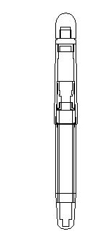
At each stage of design and production, Bruce took me through his meticulously
created drawings and measurements.
These included the specifications that he would be working from since, unlike
many other penmakers, Bruce hand turns these pens on a lathe in the same manner
as was done before the advent of computer driven equipment.
And there were considerations purely of style. Did we want to follow closely
the German modernism of the first Pelikans? That was my preference, but the
original style had been much smaller. Would this larger pen look better with
an evolutionary streamline shape? To determine that, we actually built two
distinctly different prototypes.

Once the prototypes had been completed we realized that the streamlined look
of the second prototype was much more appropriate to the esthetic of the pen
than the squared off look of the first one. Still, we presented the two prototypes
to our "test" subjects at the 2006 Ohio Pen Show.
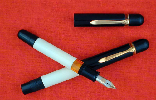
By October we were ready to assemble the prototypes. Because Bruce was less
familiar with the piston mechanisms, we decided to work together on this final
aspect. For Bruce putting a pen together is old hat, but for me this was a
real treat, particularly as I found that I liked the real thing much more than
I had anticipated.
Don't get me wrong, at each stage I was pleased with the design, otherwise
we would not have gone forward. But this was my first venture into penmaking
and up to this point I had put a good deal of faith into the process. Now,
with the tangible results before me I found myself more pleased than I had
expected to be.
In truth, this pen is somewhat larger than the pens I usually favor, but
I quickly found that its superb balance and light weight were such that was
very easy to use. Hard rubber and acrylic combined to make a pen that is light
in weight, yet substantial. I am not, of course, wholly objective with regard
to the pen but the real test came just a day later when I was forced to give
over the weekend to grading papers. When grading, I do tend to favor larger
pens in order to avoid the fatigue that can come from holding a pen all day.
In fact, I usually switch around for the sake of both comfort and variety.
For two days, this one pen served me as well as anything I own.
As of this writing, this pen can be yours. Bruce has made the first batch
and others are on the way. But we are making the pen in extremely small numbers,
no more than twenty will be produced and most of them will be to order. So,
if, after reading this and looking at the images, the pen interests you, now
is the time to act. The pen will be ready by the end of summer and will cost
$950.00. Half of that is payable now, with the balance due on shipping. To
start the process send me an e-mail.
|
